In the world of visual communication, charts and dashboards function much like theatre stages. The data is the performer, trying to deliver meaning with clarity and emotion. But if the stage is cluttered with unnecessary props, bright lights, and distracting banners, the audience might struggle to notice the performance at all. Edward Tufte’s principle of the data-ink ratio speaks to this challenge. It encourages designers to remove non-essential elements so that the message of the data stands strong, clear and uninterrupted. Instead of overwhelming the viewer with visual noise, the data-ink ratio promotes purposeful simplicity.
When learners explore a data analytics course, this principle becomes not just theoretical but transformative. It shifts the mindset from “How do I decorate my chart?” to “How do I illuminate my message?”
Understanding Data as a Story Told Through Minimalism
Imagine a map drawn during a treasure hunt. The objective is to help the adventurer reach the treasure. If the map is overloaded with decorative drawings of oceans, forests, and sea creatures, the path becomes harder to follow. Similarly, charts that include heavy gridlines, unnecessary background shading, bold borders, or flashy icons complicate the viewer’s journey toward insight. Tufte’s principle asks: What is essential to understanding the data, and what is only decoration?
This metaphor helps us see data visualisation as purposeful storytelling. Ink should be allocated to showing the key patterns, shifts and relationships, instead of ornamental flair.
The Art of Removing to Reveal
Good data design is often not about adding but removing. Many designers initially assume that adding color, shapes, or icons improves engagement. Instead, the visual becomes crowded, forcing the audience to decode layers of styling before even noticing the numbers. The removal process is similar to a sculptor chiselling away marble. The form emerges not from what is added, but from what is taken away.
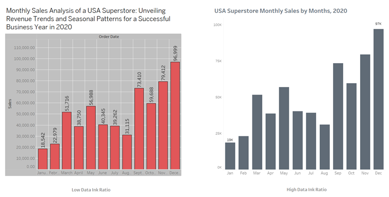
When learning through a data analyst course in pune, students often practice taking a cluttered chart and refining it. The goal is not to make the visual plain or dull, but to make it honest, focused, and easier to interpret.
Real-World Example 1: A Retail Dashboard That Hid the Real Problem
A retail chain once struggled to understand why certain stores underperformed despite high foot traffic. Their dashboard included bright colours, thick borders, stacked bar charts, logos and even motivational quotes. Viewers missed the subtle but critical pattern: high foot traffic correlated with low conversion rates. Once the dashboard was redesigned with only the key metrics, simple line charts, and light visual elements, the insight became obvious. More customers were entering than purchasing. The decision to retrain store staff emerged naturally from this uncluttered clarity.
Real-World Example 2: Finance Reporting Turned into Clarity
An investment firm produced monthly client reports with pie charts filled with gradients, shadows and vibrant colours. Investors felt overwhelmed, mistrusted the presentation, and often called for clarifications. By adopting the data-ink principle, the firm switched to clean bar and line charts, removed decorative shading, and emphasised percentage changes and risk markers. Clients reported feeling more confident because the visuals now appeared transparent and direct. The data began to speak for itself without visual exaggeration.
Real-World Example 3: Healthcare Visualisations that Supported Faster Decisions
A hospital analyzed patient wait times and recovery durations. Their initial visualisations included large tables, multiple chart types and dense labeling. Doctors found it difficult to make decisions quickly. A design team simplified the charts by highlighting only the critical durations and using subtle visual cues to indicate risk zones. The data became readable at a glance, allowing medical staff to prioritize resource allocation effectively. The redesign helped improve patient experience simply through clearer visual communication.
Practical Ways to Improve Data-Ink Ratio
- Remove heavy borders and gridlines. Use light or minimal lines.
- Choose one or two colors for emphasis, not a rainbow palette.
- Label data points directly when possible instead of using legends.
- Avoid 3D charts, drop shadows, and gradients that distort perception.
- Highlight only the key data values that matter to decision-making.
This practice is not about stripping charts bare but ensuring every element has a purpose. The intention is clarity, not plainness.
Conclusion: Data Deserves a Clear Voice
Tufte’s data-ink principle reminds us that clarity is a design choice. The more noise we remove, the more insight becomes visible. When visuals direct attention to the true message instead of decoration, decision-making becomes faster, more confident and more accurate. Whether designing dashboards for business, healthcare or finance, the aim is the same: allow the data to speak with clarity.
To become skilled in creating visuals that are both meaningful and elegant, one must learn to see design as a communicator, not a decorator. The stage must support the performance, not overshadow it.
Business Name: ExcelR – Data Science, Data Analyst Course Training
Address: 1st Floor, East Court Phoenix Market City, F-02, Clover Park, Viman Nagar, Pune, Maharashtra 411014
Phone Number: 096997 53213
Email Id: enquiry@excelr.com